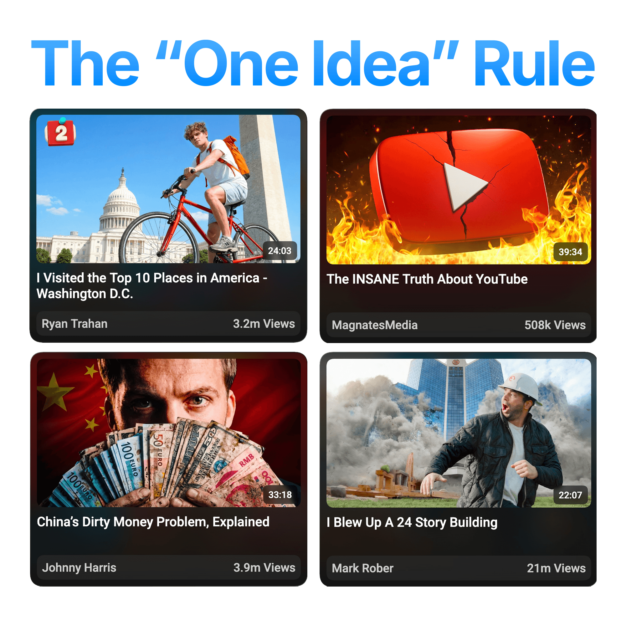
Youtube Packaging Tip #19: The "One Idea" Rule

One of the biggest mistakes I see in thumbnails is trying to communicate too many ideas at once.
Creators often think adding more elements will make the thumbnail more interesting. Another arrow. Another circle. Another piece of text. But every new element has to compete for the viewer's attention
A thumbnail isn't supposed to explain the entire video, that's what the video is for. Its supposed to communicate one clear idea that makes someone curious enough to click
A simple question I ask while designing is:
"If someone could only remember one thing from this thumbnail, what would it be?"
If the answer isn't obvious, the thumbnail probably isn't focused enough.
Think about how people actually use Youtube. They aren't stopping to analyze every detail, they're scrolling quickly and making split-second decisions about what deserves their attention. If your main idea isn't immediately clear, it gets lost among everything else
The best thumbnails have a strong focal point. Every other element exists to support that focal point, not compete with it. Try asking, "What can I remove while keeping the main idea just as clear?"
More often than not, that's where the better thumbnail is like the ones below